2019 Fellows
Roadblocks to Synthesis
by Gage Clawson and Molly Williams - August 20, 2019
OHI and Open Data Science
The global Ocean Health Index (OHI) is a collaborative, ongoing project that measures the ocean health of all coastal countries and territories. The OHI global assessment is a unique endeavour that is reproduced each year using large, diverse, and evolving datasets. The OHI assessment is possible because scientists, governments, and research groups freely share their data. Beginning in 2012, OHI researchers have used data science tools and practices to enable open science, and built a strong foundation for consistency and efficiency in the global assessment. During our time as global fellows, we’ve followed in the footsteps of previous OHI practitioners. However, as we have gathered and prepared data for the 2019 assessment, we have encountered frequent challenges that slow have slowed us down. These challenges have prompted us to identify areas of improvement to streamline future assessments and do better science in less time.
Metadata and the importance of thorough documentation
One of the foremost issues we have encountered is a lack of consistent and complete documentation of data, which serves as a major roadblock to conducting synthesis science. An important aspect of good data management is providing thorough documentation of the data. Metadata describes the data source, such as where, when, and how data was collected, along with what variables are included in the dataset and any assumptions necessary to understand the data.
As Global Fellows, one of our main tasks is to see whether new data are available from each of our sources used for the annual assessment. The OHI team produces detailed metadata for each source, which we revisit each year and update to reflect changes in data and methods (if necessary). Creating detailed metadata takes time, and can quickly become outdated. This is a problem we contend with across many of the sources used to calculate the OHI, which sometimes have missing, incomplete, or confusing metadata. This is especially problematic when updating or finding new data to improve OHI assessments, as this information is necessary to determine how we can use it for our purposes.
For example, one dataset we scrutinized for the 2019 assessment had inconsistencies with column names between the raw downloaded data and the metadata provided. We use R and RStudio for all of our data prep, which has zero tolerance for inconsistencies and will generate an error. When R flags these errors, we have to investigate whether the difference is due to something simple like a small column name change, or a larger alteration to the data. Issues such as these may slow down our data preparation, but allow us to maintain the scientific rigor of the OHI despite inevitable changes to the available data.
Challenges to updating data and methods
One of the biggest challenges to updating the OHI scores is ensuring that we are obtaining the correct, and most recent, source data. We document the process for locating and downloading the data in our data prep scripts, or in our internal documentation for that particular dataset ( GitHub issues is a fantastic tool for project management and process development! ). Most of the time this information is clear and easily accessible, but in some cases it’s not obvious where the data are sourced from or how to access it. This is when clear communication and thorough documentation becomes especially important for streamlining and improving the global assessment.
Once we locate the source of the data, we often discover that the source has retroactively updated their previous years’ of data. Overall, these changes are good and we welcome them because they indicate that data are being optimized over time through the correction of errors or improvements to underlying models. But this does present challenges on our end, and again slows the data preparation process. This type of change to source data requires us to back-calculate all previous years of OHI scores every year so we can accurately compare changes across time.
Improving the process on our end
As global fellows, we are tasked with identifying areas for improvement in the global assessment, and this often means revamping our own documentation. Much of what we have learned about good data management comes from addressing failures of documentation on our end. For example, one of the layers that has required a large overhaul is the habitat data. Habitat data for seagrass, saltmarsh, mangrove, and coral habitats have not been updated since the original 2012 assessment because of the unavailability of new data. The location where we stored the original raw data for these habitats is largely unclear. Furthermore, the methods used to prepare these data have been lost over time because these data were not prepared using R scripts. This presents a problem, because now that updated data are available, it has not been entirely clear how to replicate the original methods to calculate scores. However, it has presented an opportunity to write thorough methods for goals such as these, which is why we are here!
After encountering issues with documentation both internally and externally, we want to help future OHI practitioners navigate them in the future. As mentioned in our previous post, we are writing the first iteration of the OHI Global Guide, which will outline step by step how to conduct the assessment. In this guide, we will include clearly defined methods for updated layers and steps to documenting metadata to ensure that the process is clear for future assessments.
What we’ve done so far!
by Gage Clawson and Molly Williams - June 25, 2019
Since joining the OHI team in January, we’ve begun to help lay the foundation for the 2019 Global Assessment. Over the past couple of months we’ve fit in coding whenever we can amongst the chaos of being graduate students. Now that one of us is graduated and the other is sprung free for the summer, we’re free to focus on OHI full time!
Our training came in the form of learning by doing, and we developed our skills by diving right into preparing data for different goals and subgoals. But first, we learned the importance of open data science, which is the underlying principle guiding the work we do. From there, we collaborated on our initial projects and then moved into working independently to update the assessment. The OHI team also puts a strong emphasis on continued development, so each week we have a “seaside chat” to discuss workflows or share a new tool we’ve learned about. (So far, they’ve all been remote over Zoom, but we hope that one day we will actually chat by the sea here in beautiful SB!)
Through the process, we’ve learned the importance of and practiced good documentation, and keep track of our progress via GitHub issues. Part of practicing open data science is meticulously describing problems or anomalies you encounter in painstaking detail, in the hopes that one of your colleagues will understand what you’re trying to say and can help. Communication is key! This also led us to start the first guide to the OHI Global Assessment in a very cool feature of RStudio, called Bookdown to be used by future practitioners of OHI Global.
Thus far we have completed, or are in the process of completing data prep for 8 goals/subgoals for the 2019 OHI assessment. Below is an outline of each of these goals/subgoals, with descriptions of what may have changed in the 2019 assessment:
Artisanal Fishing Opportunity
This goal represents the opportunity for small-scale fishers to supply catch for their families, members of their local communities, or sell in local markets.
In the past this goal has penalized regions with low or no population, giving a score of 0. However, we decided to change this to give a score of NA to those low population regions (regions with a population less than 300), as those regions likely do not have much opportunity to capitalize on fishing in the area as regions with larger populations.
Sense of Place: Lasting Special Places
The lasting special places subgoal represents the conservation status of geographic locations that contribute to cultural identity.
Nothing has changed for this years assessment, other than downloading the most current data. We did conduct some research to find alternate data that might better reflect the quality of protect areas, but determined that the current data is the best available.
Biodiversity: Species
This subgoal is calculated to show the conservation status of native marine species.
This year we updated the IUCN red list of threatened species and birdlife international data. We decided to use a slightly different approach for the data prep this year. We followed the same process as Casey O’Hara (an OHI project scientist) in his newly published paper, “Mapping status and conservation of global at-risk marine biodiversity”, to determine the status of at-risk marine species on the IUCN red list of threatened species.
Food Provision: Mariculture - in progress
The mariculture subgoal is used to assess the sustainable harvest of seafood from mariculture.
In the future it would be ideal to update our sustainability data to be more current. However, from some sleuthing, it was determined there is nothing available that is better than our current data, which is from 2008.
We are researching ways to change the reference point for this subgoal. Currently, the reference point is based on a country’s performance relative to other countries. We divide the tons of mariculture harvested by the number of people along the coast, and divide this by the value from one of the high performing countries. This doesn’t consider the mariculture capacity of each country (how much they could be harvesting). Now we have data showing how much each country should be able to produce via aquaculture for finfish and bivalves, seen in a research paper entitled “Mapping the global potential for marine aquaculture”. We believe we can use these estimates to better represent a reference level and conduct a more informed analysis.
Sense of Place: Iconic Species
Upon starting this goal, we ran into a missing data problem. This was quickly solved! Read_csv only looks at the first 1000 lines of data to guess the column type, and read a numeric column as logical, which made the region IDs go missing from an intermediate data set. Solved by hard-coding in col-types on import.
After completion of the data prep script, some outliers appeared. A few regions with few numbers of iconic species saw jumps in status due IUCN status changes in one or two of these species (a source data issue).
Coastal population layer for determining mariculture pressure - in progress
Natural products - in progress
Pressure Calculation Update: World Governance
This is one of the three indicators to assess social pressure and resilience (we saw small changes to pressure and resilience based on WB source data). We identified some areas for improvement, and utilized data management SOP.
Pressure Calculation Update: Targeted Species - in progress
2018 Fellows
Agile OHI
by Ellie Campbell - August 9, 2018
I recently was reading about Agile software development, a methodology of software development many organizations today practice in some form, which emphasizes flexibility, speed, and collaboration. Features typically associated with an Agile approach include: inherent adaptability; continuous planning and evolution; iterative work flow and integration of continuous feedback; automated testing; and a focus on empowering people to collaborate. The methodology was formalized in 2001 in Agile Manifesto:
We are uncovering better ways of developing software by doing it and helping others do it.
Through this we have come to value:
Individuals and interactions over processes and tools
Working software over comprehensive documentation
Customer collaboration over contract negotiation
Responding to change over following a plan
That is, while there is value in the items on the right, we value the items on the left more.
There are also 12 principles that expand on the values of the Agile Manifesto. As I was reading, I recognized many parallels between the Agile principles and our philosophy for developing and using OHI software, or what we refer to as the OHI Toolbox. The OHI is unique and progressive in the way it adapts software development tools to a scientific-research context, to do better science in less time. Similar to how the waterfall development methodology (a precursor to Agile) was borrowed from Henry Ford’s assembly-line manufacturing method,* we have adopted many of the tools and methods used by the software development community, to use for reproducible and collaborative science. I thought it would be an interesting exercise to describe how the principles map onto our workflows, and where they diverge. This is what I came up with.
Twelve Agile Principles in the context of the OHI and OHI Global Fellowship:
Our highest priority is to support policy and decision makers through early and continuous delivery of valuable software for assessing ocean health, and of the annual global ocean health scores themselves. Our highest priority is to satisfy the customer through early and continuous delivery of valuable software.
We welcome diverse and evolving requirements for a healthy ocean. We designed the OHI software to be flexible and adaptable for regional assessments, where priorities differ or additional region-specific data is available. Welcome changing requirements, even late in development. Agile processes harness change for the customer’s competitive advantage.
Deliver working software frequently, with incremental improvements made during each annual OHI global assessment. Deliver working software frequently, from a couple of weeks to a couple of months, with a preference to the shorter time scale.
Stakeholders, regional planners, and marine data scientists work together throughout OHI+ assessments to create regionally relevant and, ideally, politically useful ocean health models, metrics, reports and visualizations. Business people and developers must work together daily throughout the project.
Motivated individuals and agencies are encouraged to take on their own OHI projects (OHI+ assessments) and the OHI team will strive to provide the support and tools they need. Another example is the OHI Global Fellowship and our individual projects! Build projects around motivated individuals. Give them the environment and support they need, and trust them to get the job done.
The most efficient and effective method of conveying information to and within a team is face-to-face conversation. Other modes such as GitHub issues, or Slack channels are useful for keeping track of ongoing discussions, especially for future reference. The most efficient and effective method of conveying information to and within a development team is face-to-face conversation.
The most important thing is that our software is functional, as its use is the primary measure of its value and impact. However, since we try to make it usable by others who may have less programming experience, another important measure of progress is the accessibility or transparency in what the code is doing, and the documentation which allows others to adapt and/or reproduce ocean health assessments. Here we may diverge slightly from the Agile principles, as we see documentation and communication as a critical piece of what we do. Working software is the primary measure of progress.
Sustained development and recurrent assessments are the ultimate goal. Sponsors, developers, and users should be able to maintain a constant pace going into the future. OHI was conceived of as an ongoing project, so ocean health could be evaluated consistently over time and space. Agile processes promote sustainable development. The sponsors, developers, and users should be able to maintain a constant pace indefinitely.
Continuous attention to technical excellence and good design enhances agility. We aim to improve the design of our software each iteration, in order to increase the ease and efficiency of future assessments. Continuous attention to technical excellence and good design enhances agility.
Simplicity–the art of maximizing the amount of work not done–is essential. With limited time, decisions must be made about how to prioritize adjustments and updates. Our approach in this arena is fairly ad hoc; we could perhaps reflect on whether there is a more deliberate way we could do this. Simplicity–the art of maximizing the amount of work not done–is essential.
The best architectures, requirements, and designs emerge from self-organizing teams. On the OHI team, modes of organization, communication mediums, and work processes are suggested by team members and leaders. These evolve organically over time based on how the team uses them collectively. The best architectures, requirements, and designs emerge from self-organizing teams.
At bi-weekly meetings we refer to as “sea-side chats,” we reflect on tasks accomplished and discuss tools and approaches for becoming more effective, and we adjust accordingly. At regular intervals, the team reflects on how to become more effective, then adjusts its behavior accordingly.
After completing this exercise, one question I have is this: are our divergences from the Agile principles and philosophy irreconcilable because the nature of our work is fundamentally different or could we possibly improve our workflows by matching them more closely?
While I would say that we do not abide by the first statement of the Agile Manifesto – we value our interactions and tools equally, and it is often our processes and tools that allow the individuals to thrive and our exchanges to elevate the work of our entire team – we hold true to the rest. Enough, I think, to claim OHI is in essence Agile.
Geospatial processing in R
by Iwen Su - July 30, 2018
Summary: Geospatial processing in R is really nice, straightforward, replicable by yourself or a collaborator due to code documentation practices, and you can save iterative maps UNLESS your spatial files are massive. Then your RStudio will crash just as much or more than it would in ArcGIS. Regardless, the replicable code and iterative versioning is worth it.
Opening Up Shapefile Data
There are two ways you can upload shapefiles into RStudio. You can read it in as a normal spatial polygons file (class: SpatialPolygonsDataFrame) or as a simple features file (class: sf and dataframe). While they are both spatial data, the latter acts more like a dataframe with a column for geometry information. It is a relatively new functionality and can be done through the sf package, which usually allows you to upload your shapefile in a LOT faster than preserving the original file type using the sp package.
We’re dealing with massive datasets for OHI so every second counts!
Here is an example of how to read in a spatial file as a SpatialPolygonsDataFrame:
wdpa_poly <- rgdal::readOGR(dsn = "/ohi/shps",
                       layer = "wdpa_poly_shapefile",
                       stringsAsFactors = FALSE)
To determine how much time it takes to run this process, you can sandwich your code between proc.time() and a time-elapsed message using cat(). Run all of this together.
start <- proc.time()

wdpa_poly <- rgdal::readOGR(dsn = "/ohi/shps",
                       layer = "wdpa_poly_shapefile",
                       stringsAsFactors = FALSE)

cat('elapsed: ', (proc.time() - start)[3])
elapsed: 402.000Time elapsed is 402 seconds, or 6.7 minutes.
Alright, what if we read in the spatial file as an sf or dataframe object:
start <- proc.time()

wdpa_sf <- st_read(dsn = "ohi/shps",
layer = "wdpa_poly_shapefile")

cat('elapsed: ', (proc.time() - start)[3])
elapsed: 49.000Time elapsed is only 49 seconds!
The simple features format of the spatial file is processed a lot faster than the shapefile format. While in this case the difference is only about 5 to 6 minutes, the time sf will save you will become more important when you read in larger shapefiles. Or if you have to finish up your task to make it to happy hour.
Viewing Spatial Data
The strengths of dealing with spatial data in R is the geospatial processing or subsetting and manipulation of the values itself. What’s really cool about sf is that you can manipulate the attribute table associated with the data using your handy dplyr and tidyverse tools. This is because the simple features spatial object is essentially just a data frame or tibble with a column for the spatial coordinates information.
Usually, viewing the actual attribute table is really laggy in R and can cause the program to crash, especially since spatial files are often really large. Or you just have to wait several minutes. For example, when trying to view the data for the spatial file using View(wdpa_sf), I received a “Page Unresponsive” message:
Instead of viewing the entire data table, I prefer to explore summary snippets of the spatial data in the console, such as the column names:
names(wdpa_sf)
 [1] "wdpaid"     "name"       "orig_name"  "desig"
 [5] "desig_eng"  "desig_type" "iucn_cat"   "marine"
 [9] "no_take"    "no_tk_area" "status"     "status_yr"
[13] "mang_auth"  "mang_plan"  "verif"      "sub_loc"
[17] "parent_iso" "iso3"       "geometry"
I can look at a summary of the different columns:
summary(wdpa_sf)
     wdpaid                                            name
 Min.   :        1   Mangroove                           :   172
 1st Qu.:   187232   Ek                                  :   143
 Median :   392042   Local Land Trust Preserve           :    53
 Mean   :232758618   Not Reported                        :    53
 3rd Qu.:555551680   Kiimingin Letot (luonnonsuojelualue):    51
 Max.   :555636685   Wetlands                            :    29
                     (Other)                             :215268
          no_take         no_tk_area               status
 All           :   663   Min.   :      0.0   Designated:215769
 None          :   328   1st Qu.:      0.0
 Not Applicable:201539   Median :      0.0
 Not Reported  : 12724   Mean   :     39.7
 Part          :   515   3rd Qu.:      0.0
                         Max.   :1555851.0
This is a lot better than waiting for it to open in the window.
Subsetting & Manipulating
If you want to create a subset of the spatial data in ArcGIS, you have to go through a tedious process in “Select By Attributes” with no option to save your processing method (e.g. STATUS_YR >= 2015). So let’s say you want to filter your dataset using different criteria, your previous specification will be removed. The only thing you can save is the output data, but not the code you used to create it. This makes replication and data checking difficult.
Subsetting the spatial data in RStudio can make it a bit more manageable to plot. Here, I’m just going to focus on MPAs designated in year 2015 onwards, the area of any no take designation within the reserve, and the year the MPA was first designated.
wdpa <- wdpa_sf %>%
  filter(status_yr >= 2015) %>%
  select(name,no_tk_area,status_yr)
As an sf object, I can treat the spatial data just like a data frame and use dplyr functions such as filter and select to “Select By Attributes”. This preserves the original data and easily creates a new data frame with the truncated version. So now I have original dataset wdpa_sf and intermediate dataset called wdpa.
Exploring & Plotting
You can plot spatial files in RStudio as well once you’ve read it in and filtered it as desired, but it’s usually a simplistic glance.
plot(wdpa_sf[1])What are all the values? So the [1] specifies that you are taking the values in the first column, which is meaningless as it is just a WDPA id number. Let’s say I don’t want any special values. I can use st_geometry to just plot the shapes without values:
plot(st_geometry(wdpa_sf))You can also add annotations to take a better look at the values, but this would require an understanding of the columns or attributes first. It looks like I can categorize the values by either the No Take Area, Status Year (the year it was designated), or IUCN category column.
I want to plot values of no take areas for each protected area designation. I can call the name of that column, no_tk_area to map the values.
wdpa <- wdpa_sf %>%
  filter(status_yr >= 2015) %>%
  select(name,no_tk_area,status_yr)

library(maps)
plot(wdpa["no_tk_area"], axes = TRUE, main="Global No Take Area in MPA Zones")
The axes annotation added latitude and longitude coordinate axes and main was used to specify a title. However, I’d like to add continents onto this map as a background layer. This can be accomplished with the maps package.
library(maps)
plot(wdpa["no_tk_area"], axes = TRUE, main="Global No Take Area in MPA Zones");maps::map('world',add=T, fill=T, col='gray')
Geospatial Processing
The last topic I’ll only touch upon briefly. Many of the geospatial processing tools you conduct in ArcGIS, such as transforming coordinate systems or finding the intersection between two shapefiles have equivalents in the sf package.
Here I want to transform the coordinates of my shapefile regions into the same coordinate system as the shapefile wdpa_sf. First I read the shapefiles in using the sf method,
regions <- sf::st_read(dsn = "some/file/path/to/folder", layer = "name-of-shapefile-without-extension")

wdpa_sf <- sf::st_read(dsn = file.path(dir_M, 'git-annex/globalprep/_raw_data/wdpa_mpa/d2018/WDPA_June2018-shapefile'), layer = 'WDPA_June2018-shapefile-polygons')
then with a single line of code, I can transform the coordinates system in regions to match that of wdpa_sf.
regions_transformed <- st_transform(regions, st_crs(wdpa_sf))Finding the intersection is as simple as running a single function: st_intersection and specifying the polygons of interest.
find_intersection <- st_intersection(wdpa_18, regions_t)Not only are these spatial analyses and processing tools available in R, but, once again, you have the capability to document and share how you created intermediate shapefiles, step by step. See sf tutorial for a list of other common geospatial processing functions.
Conclusion: Even though ArcMap crashes a lot and can also be quite laggy, viewing and exploring spatial data visually is often best in ArcMap OR QGIS which is free, instead of R, especially if your geographic range is large (like the GLOBAL EXTENT). However, if you don’t have a lot of money to throw or work for a spatial company, R can show you the basics and is particularly smooth when documenting and running geospatial processing. If you were only working on a smaller region like the United States or California, then it may be easier to make a quick map to email someone but not for publication necessarily, since you’re missing out on ArcMap’s nice alignment guides, titles, subtitles, adding basemaps as easily.
Behind the scenes: Data_prep
by Camila Vargas - July 16, 2018
On March 6 2018 we read Introduction to Open Data Science. Chapter 6: Data Wrangling - Dplyr. This chapter starts with the quote:
“Data scientists, according to interviews and expert estimates, spend from 50 percent to 80 percent of their time mired in the mundane labor of collecting and preparing data, before it can be explored for useful information. -NYTimes (2014)”
This was the beginning of our training in data wrangling, four months ago. Throughout these months, I’ve realized that though this quote is quite accurate – we do spend most of our time collecting and preparing data – I disagree in describing this labor as mundane.
It is not easy, that’s for sure. And many times it can be frustrating and feel hopeless. But one thing is for certain: by going over a dataprep script, I have learned much more about coding and R functions than in any class I’ve taken.
One of the most important parts of calculating the Ocean Health Index is preparing the data. First, we see if there are any updates on the data from each of the data sources. Then, if the data has been updated, we download the raw data from the pertinent source, wrangle it and organize into the necessary form to calculate scores.
It is something close to magic. By running a data_prep script you go from something extremely overwhelming like this:
To something as tidy as this:
But it is not quite magic. This whole procedure is far from being a single spell with a magic wand. Nothing is less straightforward than the process of preparing data.
Here, I’ll share some insights from my experience so far:
Every time I start a new script I’m optimistic. I start with the idea that this will be fairly uncomplicated. The data is not too muddled and there is already a script that takes care of the process.
Here we go. We start by searching if there are any updates to the data. Data has been updated. That is good. More data means that our analysis will be more robust and up-to-date. But, obstacle #1: the data source changed the way they reported the data.
This is not necessarily bad. Looking at the big picture, changes in the way data is reported can mean improvement in the data, which overall means improvement in our analysis. In many cases though, it also means that we have to revise our methods. But, methods cannot change too much because they should be as consistent as possible so that the index can be compared through time.
And then, not only the method, but little things like the format of the new data, how each region is reported, and does that match with the OHI regions, and so on. All of this must be adjusted in a nuanced way.
Finally you get everything to work. Yihaa!! Definitely a moment of pride. The final step is to check if the outcome you are getting with this year’s data is similar enough to the outcome of last year’s data. And then you get something like this…
- Not quite a match. And here we go again.. Check everything you have done. Revise methods, revise code, check data in every step of the wrangling process. The goal is to figure out why is the data so different from last year assessment.
That is in part what we do. We spend 50%, probably closer to 80%, of our time collecting and preparing data. It is challenging, but the kind of challenge that, at least for me, makes me want to spend all the necessary time to find the best solution. Maybe you spend way more time than what you anticipated. But at the end, when you reach the final outcome, there is a great satisfaction. You finally get to input the data into ohi-global which sources functions from ohi-core, an R package that calculates status, trend, pressure, resilience, and in some cases, scores. Yes finally, scores!
This whole process is compared to the job of an editor, or the backstage of a show: so much hard work behind the scenes is never seen by the final audience. But without all this work the play would not play. Behind the scenes is key for putting together a successful show!
Some of us chose this role. I wanted to share a little bit of how the OHI day-to-day looks for me: long, hard hours and days of work, constantly checking if what you are doing make sense, revising methods and outcomes, comparing outcomes to what has been obtained years before. A great learning experience and overall very rewarding (even addictive).
Grappling with Graphics
by Ellie Campbell - April 30, 2018
The plotting capabilities in base plot in R are good, but for more flexibility and control, ggplot is the gold standard. In ggplot, the first line creates a plot object and points to whatever data you will be plotting. Then, one can dictate the form of the plot using any number of “geoms,” designing individual components separately and adding them to the plot, along with formatting elements like labels, title, and themes.
My first introduction to ggplot, and to R as a whole, was through the lab component of a statistics course I took my first year at the Bren School. That first time around, ggplot was introduced in lecture with a few associated in-class exercises and then over the course of the semester I spent hours tinkering with and refining presentation – palettes, graph types, fonts and features – for various assignments, a process that involved lots of google searches and scrounging through stack overflow for fragments of code to get things like outlines, or legends, or offsets in bar graphs just precisely right.
A few weeks ago, we went over the use of ggplot as part of our training in preparation for calculating the 2018 OHI. We began with a structured tutorial also, and dove deeper into the meaning and syntax of the arguments, walking step-by-step through some of the nitty-gritty details and more advanced capabilities. One thing in particular that became more clear to me, was the functionality of aes() or the “aesthetics,” which was something I’d found particularly confusing in my first encounters with ggplot. For example, it was not completely clear to me why you would put some arguments within aes() and some outside aes(), or define x and y in aes() in the first line versus individual geoms; e.g. these give the same plot:
ggplot(data = tips, aes(x = total_bill, y = tip/total_bill, color = day)) +
  geom_point(size = 0.25)

ggplot(data = tips, aes(color = day)) +
  geom_point(aes(x = total_bill, y = tip/total_bill), size = 0.25)

ggplot(data = tips) +
  geom_point(aes(x = total_bill, y = tip/total_bill, color = day), size = 0.25)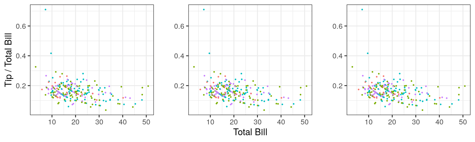
Other takeaways for me were (1) modularity of ggplot means it is good for more complicated graphics, but perhaps unnecessarily verbose for simple plots (2) facetting is a very helpful feature for looking at multifaceted data (3) there are many theme options for making pretty plots, some of which can be found in the ggthemes package, and (4) ggplot is especially powerful for data visualization when combined with other packages in tidyverse! For example, using some data from the gapminder dataset:
gap <- gapminder %>%
  filter(continent == "Europe") %>%
  mutate(cummean_gdpPercap = cummean(gdpPercap)) %>%
  group_by(country) %>%
  filter(max(cummean_gdpPercap)-min(cummean_gdpPercap) > 2000) %>%
  ungroup()

ggplot(data = gap) +
  geom_line(aes(x = year, y = cummean_gdpPercap), color = "lightsteelblue") +
  geom_line(aes(x = year, y = gdpPercap), color = "coral") +
  facet_wrap(~ country) +
  theme_bw() +
labs(x = "Year", y = "Cumulative Mean per Cap. GDP \n") 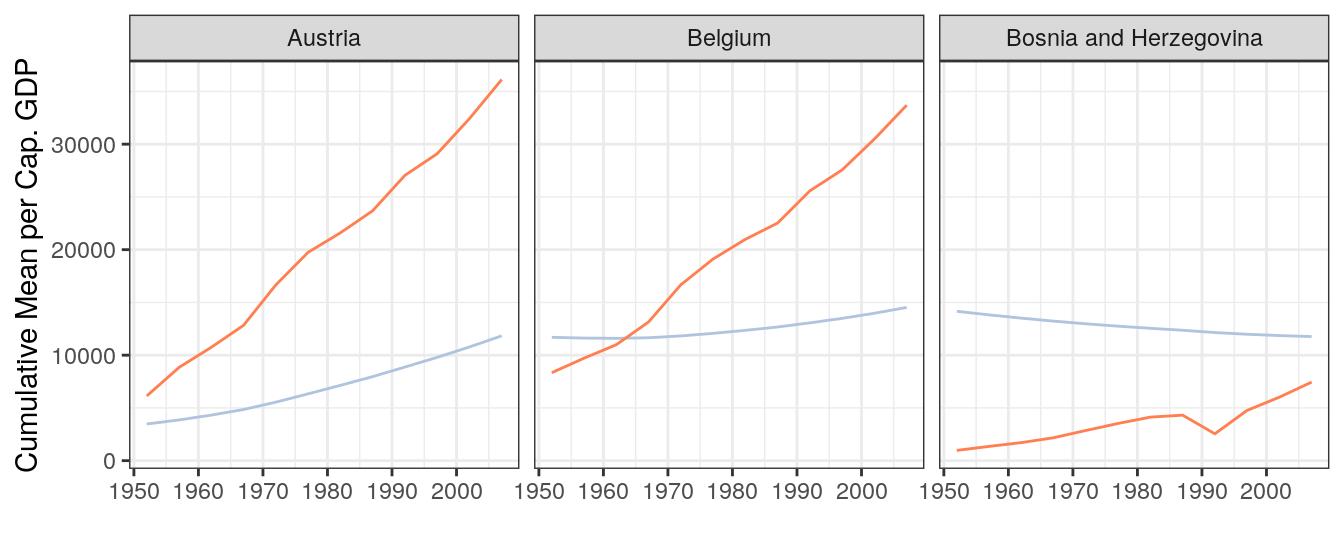
The details of ggplot stuck with me somewhat better this time around, and it is hard to say how much of that was because of previous hours spent tinkering with ggplot, and how much was because we walked through the details step-by-step and as a group. I wonder, when developing proficiency with some computer language or software, what is the relative return from hours spent on collaborative learning, structured tutorials, or individual tinkering? What about an optimal combination of these?
There’s certainly an huge advantage to learning with others – you can bounce ideas off each other, and ask for help. And it is more fun! Having a mentor is likewise invaluable. Despite the vast online help available and the magic that is Google, sometimes asking another human is a shorter, easier path to answers we are seeking.
GitHubbing through Life
by Iwen Su - April 6, 2018
My first experience with GitHub was fairly painless, except that I hadn’t differentiated it from just another server where you could store your files and folders. “Pull, push, and commit” was written on the whiteboard so we could remember the order of operations to update files. For the most part, I didn’t run into any errors. However, many of the capabilities that GitHub wielded were unknown to me. I didn’t know that you could essentially rearrange folders and files on your local computer and update the version online with the new configuration.
It wasn’t until I watched Julie Lowndes’s video on being a marine data scientist, which did a section on using GitHub, that I got a glimpse into why you would use it, the array of things you can do with it, and what all these new terms such as “branches” and “committing” meant. In the talk, Julie quotes a 2016 Nature article that describes GitHub functionality:
“For scientist coders, [Git] works like a laboratory notebook for scientific computing …it keeps a lasting record of events”
Wait, what is “Git”? Is it just shorthand for “GitHub”? Actually, Git is the version control system that is responsible for keeping the lasting record of events. GitHub is a space, like a library, that can hold numerous laboratory notebooks, or data science projects. Andrew McWilliams does a good job at explaining the technical and functional differences between the two in a blog post.
For my master’s group project, we decided to use GitHub as our versioning library for our data analysis. The nature of the project required more than one person to work on the same document or code simultaneously. Immediately we ran into issues collaborating on the same document. These are also known as “merge conflicts” in the Git world. None of us had gotten proper training or guidance about what to expect when a merge conflict arises. Sometimes we wouldn’t notice until several days later that, to our surprise, the excel file we had been working in now had two copies of the data table, one on top of the other, accompanied with strange symbols and headers, such as:
<<<<<<< HEADor
=======Through the OHI training, I learned that this was a separator partitioning my version of the data table from my peers’ updates to the data table. We experienced several headaches from rewriting each other’s work before we realized that Git was trying to tell us something in error messages like:
CONFLICT : Merge conflict in urchindata.csv
Automatic merge failed; fix conflicts and then commit the result
Often times the error messages are intimidating, because there is coding lingo thrown into it. However, the messages usually give us a good hint as to what is causing the error. Nevertheless, there are many barriers to entry to learning GitHub and learning to want to use GitHub. One of those is the jargony vocabulary of key terms only used in the Git and GitHub world: commit, branches, merge conflicts, pull, push, master branch, repository, and projects. Read more about Git terminology here.
First Impressions
by Camila Vargas - February 23, 2018
New year, new challenges. We joined the OHI team in late January this year. I was excited to find out what our day-to-day “office” would look like. Before starting this job, I had a basic understanding of the OHI project, but to be honest, I had pretty limited experience with R (not a whole lot) and that was it. I’m a curious learner, but I would definitely not define myself as a computer programming person. Yet, here I was.
Our first “homework” was to read through the OHI 2017 Methods. While, we didn’t need to read the whole thing in detail, it was important for us to get a glimpse of how the OHI is actually calculated.
At a first glance, it was OK. I thought it was interesting to dig into the actual math within this index. But of course you don’t get the whole picture just by reading some of the method document. One of the biggest challenges (my fellow fellows agreed with me on this) was to relate the entire workflow outlined in Figure 1.1 with what is actually going on in the math – and with this I mean the formulas. Challenges inspire! We started creating an expanded version of this figure to help us connect the dots faster (not yet finalized but will soon be displayed in the OHI theory tab!).
While we were introduced to the theory behind OHI, we also walked through how everything is organized, where the actual information is, and how to get to it. All I can say about this is that it’s all about links and more links. Too many links. I’m not sure if my brain is stuck in the mindset of organizing things into respective folders or if it’s just because everything is new, but it was overwhelming to learn that there are html links for everything. For example, from the OHI 2017 Methods, there are links to GitHub and links to other websites that explain certain topics in more detail.
My initial reaction was: WHAT IS WHAT AND WHERE IS EVERYTHING?
By the end of the day, I realized it was just panic from exposure to something new. Just breath. I’m sure at some point we are going to figure out how the information is organized (because I’m pretty sure it is already well organized). Nevertheless, the OHI fellows are working on a visual explanation of this link chaos.
And links were not the only chaotic thing. We were also introduced to Github and R Markdown. Amazing tools! But you have to break the ice before you can feel comfortable and actually know what you are doing. It seemed overwhelming at the beginning, but after only four sessions of working with all this new information and I already feel more comfortable.
I am enjoying the challenge. Learning a whole lot. And looking forward to communicating to you all about our progress and experience!